
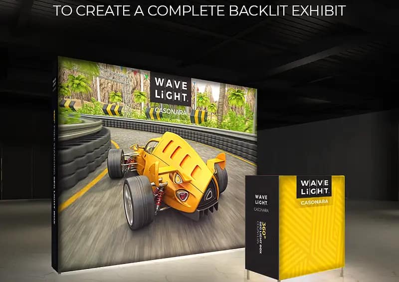
Choosing the right lighting for Waveline Casonara Banners is fast becoming a critical issue for Australian exhibitors who rely on fabric light boxes to cut through noisy trade show environments. Underpowered or poorly specified lighting can quietly sabotage even the best-designed custom fabric displays, leaving them looking flat, uneven and strangely invisible once neighbouring stands switch on brighter systems.
Why lighting quality is a hidden risk for exhibitors
Across Australian convention centres, lighting conditions vary wildly from harsh overhead spots to dim, shadowy corners. When premium fabric light boxes are dropped into this mix without tailored illumination, colours shift, skin tones look odd and key messaging loses clarity. The result is a subtle but costly erosion of high-impact event branding, where your stand simply doesn’t register in the peripheral vision of passing visitors.
Common mistakes undermining banner performance
A frequent issue is relying on venue lighting alone instead of purpose-built LED systems matched to portable illuminated displays. Exhibitors also mix cool and warm colour temperatures, creating a patchwork effect that draws attention to the light source rather than the story. Others underestimate how many lumens are needed, so their backlit exhibition graphics appear muted beside competitors using brighter, better-calibrated event signage options.

How technology choices create uneven, dull visuals
Edge-lit and back-lit LED systems are designed to push light evenly across the full surface, but cost-cutting often leads to generic strips that introduce hotspots and banding. Inadequate diffusion can cause double-sided lightbox banners to glow brighter along the frame and darker through the centre, particularly on dark backgrounds. For brands using modular trade show signage and tool-free display frames across multiple venues, non-dimmable drivers can also cause graphics to look harsh in hotel ballrooms yet washed out in brightly lit exhibition halls.
- Staff and visitors comment that the stand looks “dull” or “flat” compared with nearby portable banner solutions.
- Logos and product shots only appear vibrant in professional photos, not on the actual show floor.
- People need to step closer to read text, despite using what should be legible fonts and sizes.
- Heavy editing is required on event photography to correct colour and contrast issues.
- Reusable SEG banner systems look different at every venue, despite using the same hardware and prints.
If any of these warning signs sound familiar, your lighting strategy may be undermining the performance of Waveline Casonara Banners rather than supporting them. Left unaddressed, this inconsistency can reduce the lifespan of portable illuminated displays and chip away at your return on investment across a full events calendar. For brands that rely on premium fabric light boxes to anchor their presence, a lighting audit with an exhibition specialist can clarify whether adjustments to brightness, colour temperature or layout will unlock a more reliable, high-impact result before your next major show.
Now is a sensible time to review how your current setup performs under real-world conditions and ask whether your event signage options are truly working as hard as they should. Speaking with a local display expert can help you pinpoint hidden inefficiencies and plan smarter, future-ready lighting for your next round of Australian exhibitions.


