
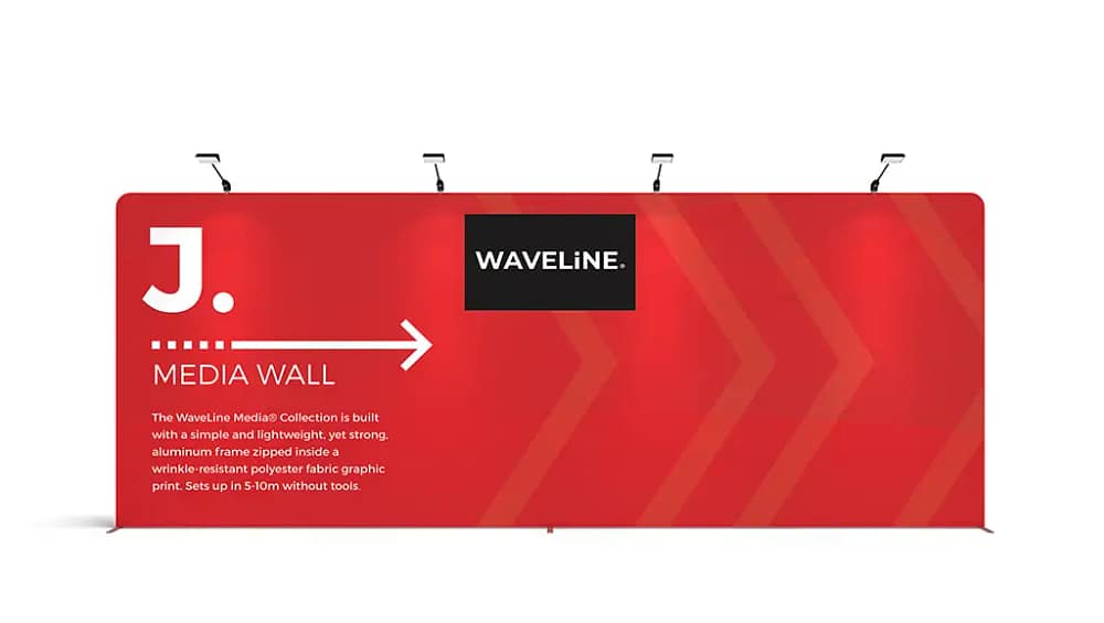
Understanding the Problem: Why Your Waveline Media Banners Fail to Stand Out
Across Australia, many exhibitors invest in Waveline Media Banners expecting a sharp lift in visibility, only to find their stands still ignored in busy aisles. The issue usually lies not in the hardware but in the graphic design choices sitting on top of it. When layouts are cluttered, branding is weak and copy is hard to read at a distance, even premium systems become background noise. In fast-paced venues, a banner that fails to communicate in seconds quietly drains your event budget.
Why Eye-Catching Design Matters in Australian Venues
Exhibition halls in Sydney, Melbourne and Brisbane are crowded, with delegates constantly scanning for clear, relevant cues. Research on face-to-face marketing shows you have only moments to signal who you are and why visitors should stop. In that window, competing portable trade show displays, digital screens and lighting all fight for attention. If your graphics lack contrast, hierarchy or a distinct brand story, your team is forced to overcompensate with harder selling and more printed collateral.

Common Design Mistakes Holding Your Banners Back
One of the most frequent errors is overloading banners with fine print, product lists and detailed diagrams that no one can absorb while walking past. Others rely on low-resolution imagery that looks pixelated when scaled to lightweight exhibition backdrops or custom fabric banner walls. Poor placement of logos and headlines, especially too low on the frame, means key messages are blocked by counters or people. Many designs also ignore how curved frames, modular event graphics and easy-setup display kits actually sit on the floor.
- Visitors pass your stand without slowing, despite steady aisle traffic nearby.
- People frequently ask basic questions your banner should answer at a glance.
- Event photos show your stand looking flat or dull next to brighter branded event backdrops.
- Sales staff rely on brochures and verbal pitches because the backdrop “doesn’t say enough”.
- Key text appears cropped, distorted or obscured by conference display systems and furniture.
These warning signs suggest your investment in trade show marketing tools is not delivering its full return. Over time, the cost of reprinting, transporting and storing underperforming portable banner stands or reusable booth signage adds up. More importantly, every event where your message is unclear is a missed opportunity to connect with qualified prospects. For brands relying on custom display solutions or custom fabric banner walls for regional roadshows, that inefficiency can quietly erode marketing impact.
When Waveline Media Banners are planned strategically, they function as silent salespeople that pre-qualify visitors before your team speaks. Strong visual hierarchy, bold imagery and disciplined copy help clarify your offer while supporting portable trade show displays or lightweight exhibition backdrops in the same space. If you are unsure whether your current graphics are working hard enough, consider a professional review focused on layout, readability and venue sightlines. Speaking with an expert in conference display systems can highlight simple design changes before your next event. Assess your current banners now and book a consultation to avoid carrying the same invisible backdrop into another major show.


