
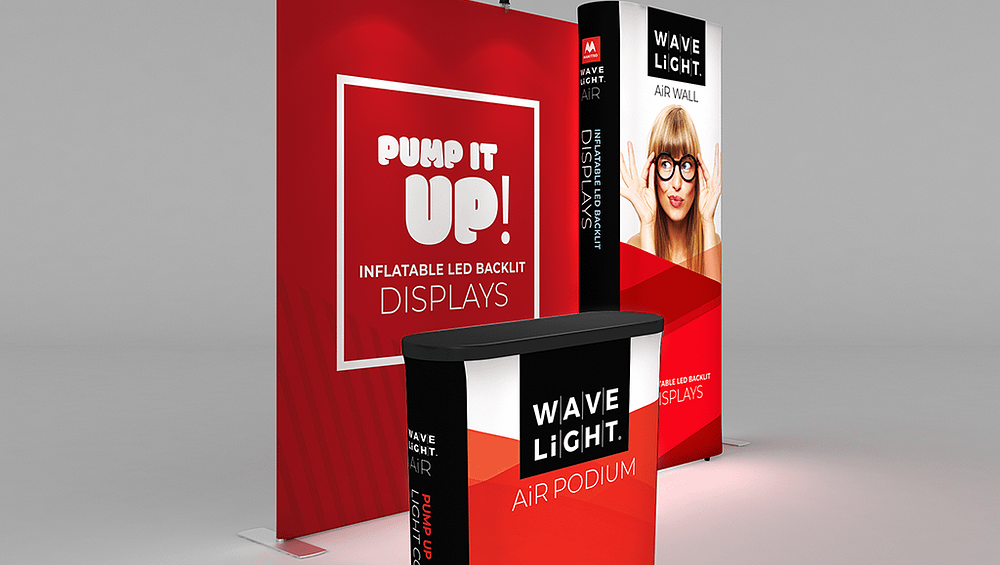
In Australia’s crowded trade show halls, How to Design Eye-Catching Fabric Banners for Trade Shows is less a creative choice and more a visibility risk. Exhibitors often invest heavily in stand space, travel and staffing, then undermine results with banners that fail to communicate in the crucial first few seconds. When messaging is unclear or hard to read at a distance, foot traffic drops, conversations stall and budgets quietly erode across the trade show season.
Understanding the stakes of trade show visibility
On a busy exhibition floor, visitors scan aisles quickly, making snap decisions about where to stop. Stands with cluttered or timid signage frequently blend into the background noise. Brands may leave believing the event was “quiet”, when the real issue was ineffective visual communication. In a competitive Australian market, that gap translates directly into missed leads, weaker brand recall and less return on already high exhibition costs.
Why Fabric Banners matter more than you think
For many exhibitors, Fabric Banners are the first and most dominant brand touchpoint on the stand. Modern systems like Tension Fabric Displays, curved tension fabric booths and hanging fabric exhibition signage are designed to maximise surface area and colour impact. Yet when layouts ignore viewer distance, venue lighting and font size, even premium hardware underperforms. A banner that appears sharp on a laptop can become illegible across a 10-metre aisle, turning a strategic asset into dead space.
Common design mistakes on fabric trade show displays
One of the most frequent issues is overcrowding: long product lists, multiple offers and dense imagery squeezed onto Fabric Exhibition Banners with no clear hierarchy. Small type, subtle colour palettes and low contrast further reduce readability under harsh venue lighting. Australian exhibitors also misjudge scale, using artwork designed for web rather than print, which leaves portable fabric displays and lightweight fabric pop up stands looking blurry or underwhelming when viewed from the aisle.
- Attendees pause at your stand but rarely initiate conversations or scan QR codes.
- People ask what your company actually does, despite standing beside your main banner.
- Event photos reveal messy messaging, tiny headlines and no obvious focal point.
- Your team relies heavily on verbal explanations because signage doesn’t carry the story.
- Post-show follow-up uncovers weak recall of your brand or offer among warm leads.
These signals suggest deeper design problems, not just a “slow show”. Cause often lies in confusing layouts, minimal testing at full size and inconsistent branding across reusable stretch fabric displays, tension fabric banner walls and custom printed fabric booth panels. Left unaddressed, each event compounds the waste, as the same flawed graphics are shipped and rebuilt nationwide.
For exhibitors planning multiple Australian shows, treating banner design as a strategic asset rather than a last-minute artwork job is critical. Investing in modular portable fabric backdrops, double-sided fabric trade show graphics and well-planned messaging can protect budgets and improve lead quality over time. If you’re unsure where to start, review recent stand photos and assess whether your core message is obvious within three seconds, then speak with a display specialist to audit your current approach before the next event locks in.