
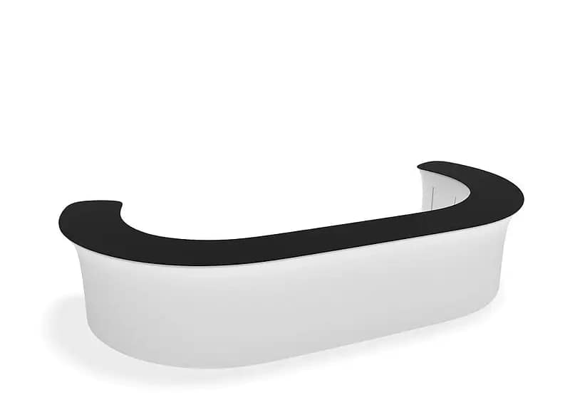
Australian exhibitors are increasingly investing in sophisticated stands, yet many still overlook how much impact their counters and information desks have on visitor behaviour. When Exploring Custom Branding Options for WaveLine® InfoDesks, it quickly becomes clear that these surfaces carry significant visual weight at the very front of a stand. If the desk looks generic or mismatched, it can undermine even the most polished backdrop or LED screen.
Why custom branding on WaveLine® InfoDesks is often ignored
In the rush to lock in floor space, lighting and AV, branding for counters is frequently left until last. Design teams may simply repurpose an old logo file or accept a default layout provided by the stand builder. This can be a costly oversight in busy Australian venues where passers-by make snap decisions based on perceived professionalism and clarity. A poorly considered counter sends subtle signals that a brand is dated, disorganised or unprepared.
How weak counter graphics dilute your exhibition message
Trade show information kiosks and portable exhibition counters sit at the natural stopping point for visitors, yet they are commonly treated as storage or laptop stands. Stock imagery, clashing colour tones and text-heavy panels create visual noise at eye level. Under harsh exhibition lighting, low-resolution logos and busy backgrounds become even harder to read from the aisle. This is particularly problematic for brands relying on portable branded counters to stand out in competitive sectors like technology, health and building services.

Warning signs your info desk branding is underperforming
Several recurring patterns suggest custom-branded info desks are not working as hard as they could. Teams often find themselves repeating the basics of who they are because the graphics fail to communicate the offer at a glance. Social media photos may crop out the company name, or show cluttered tension fabric display counters piled with brochures and bags. When visitors approach from side angles and cannot see a clear logo, the stand loses valuable brand recall.
- Attendees frequently ask basic questions about what your company does despite visible signage.
- Logos on lightweight trade show counters are only legible when viewed straight on, not from the aisle.
- Staff use modular event reception desks as ad-hoc storage, obscuring messaging and graphics.
- Colours on reusable branded display furniture appear washed out or inconsistent with corporate guidelines.
- Portable product sampling stations and custom tension fabric kiosks look like separate, unconnected elements.
These issues rarely stem from a lack of effort. More often, they trace back to rushed artwork, reusing outdated files, or treating custom display solutions as generic furniture. Dye-sublimated fabric behaves differently under LED lighting, so small type, thin lines and subtle gradients can disappear once installed. Without a clear hierarchy between logo, headline and key message, even the most advanced WaveLine® InfoDesks fail to guide passing visitors towards a conversation.
For brands competing across Australia’s major expos, every visible surface is effectively paid media. Rethinking how you brief and design custom graphics for your counters can increase stand recognition, improve wayfinding and help prospects self-qualify before they speak to staff. If any of the warning signs above sound familiar, now is the time to reassess your approach and speak with an exhibition branding specialist about your next event. A short consultation can prevent another show where your most valuable front-of-stand asset is quietly underperforming.


