The Role of Lighting in Enhancing Fabric Display Graphics
The hidden impact of poor lighting on fabric graphics
In Australian retail, shopping centres and exhibition halls, lighting is often treated as an afterthought, yet it can make or break fabric display graphics. Even premium Lightbox Fabric Banners can vanish into the background when they are under-lit or lit unevenly. Brands invest heavily in creative, print quality and floor space, but without a considered lighting plan, their campaigns risk low visibility, poor engagement and lost sales. The problem is subtle, which is why many teams only notice it once the display is already installed.
Why illumination matters for colour, clarity and brand perception
Fabric graphics are carefully profiled to match brand colours, but inconsistent lighting can shift hues, flatten contrast and make even high-end products look ordinary. In dim corners of showrooms, unlit or edge-lit prints can appear muddy, with skin tones and logos drifting off-brand. Backlit Fabric Displays, by contrast, use controlled, even LED light to maintain accurate colour and detail. When illumination is ignored, the brand message weakens, and customers subconsciously judge the entire environment as less professional and less premium.
Common lighting mistakes in Australian retail and exhibitions
Many stores and expo stands still rely on ceiling grids or basic clamp-on lamps to illuminate critical campaign graphics. This often leads to glare on gloss finishes, deep shadows across faces and products, and patchy brightness on large format fabric light walls. Portable backlit banner stands are frequently underpowered or mismatched in colour temperature, so sections of the stand appear blue in one area and yellow in another. These issues usually stem from planning displays without factoring in lux levels, beam angles or how the space changes across the day.
- Customers walk past hero visuals without slowing, or need to stand close to read key copy.
- Graphics that looked bold in the studio appear washed out or grainy once installed in-store.
- Photographers and social media teams bring additional lights just to capture acceptable images.
- Different locations roll out the same creative but displays vary wildly in brightness and colour.
- Illuminated Fabric Banners compete with brighter digital screens, making them look tired or dated.
These warning signs suggest the lighting design, not the print itself, is holding your visual merchandising back.
When to consider integrated illuminated display solutions
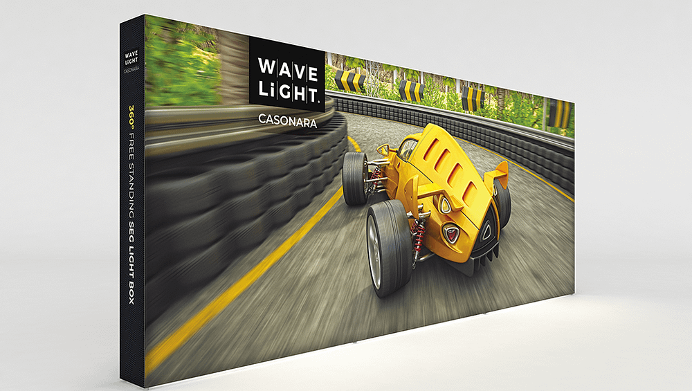
As LED Exhibition Lightboxes, wall-mounted LED fabric frames and tension fabric lightbox systems become mainstream, the gap is widening between basic fabric prints and fully engineered illuminated environments. Brands that persist with ambient-only lighting risk falling behind competitors using trade show backlit graphics, double-sided illuminated displays or ceiling-suspended glowing fabric panels to create immersive storytelling. If your next retail window fabric lightbox or expo stand is critical to a launch, it may be time to speak with specialists who understand both lighting and print engineering before the same problems repeat.
For marketing, retail and events teams, the key step now is to assess how your fabric displays actually look under real-world conditions, not just in concept visuals. Measure brightness where customers stand, compare stores or stands side by side, and document where graphics fade into the background. If you consistently see uneven illumination, colour shifts or low engagement, consider booking a consultation with an illuminated display expert to ensure your next campaign performs as strongly as your creative deserves.