Maximising visibility on a busy exhibition floor is one of the biggest challenges facing Australian exhibitors. The core problem is rarely the quality of the graphic or hardware, but the strategy behind placement. When fabric displays are positioned without considering visitor behaviour, even the strongest creative fails to cut through. This is where Maximizing Visibility: Best Placement Strategies for Fabric Displays becomes a critical issue rather than a nice-to-have refinement.
Understanding How Visibility Breaks Down on the Show Floor
Exhibition visitors typically follow main aisles, pause at corners and linger near intersections or feature zones. Yet many stands still default to a flat back-wall approach that ignores these movement patterns. The result is expensive graphics sitting where foot traffic is thinnest and sightlines are weakest. In venues like ICC Sydney and the Melbourne Convention and Exhibition Centre, this misalignment can mean thousands of missed impressions each day.
Why Fabric Display Placement Matters More Than Design
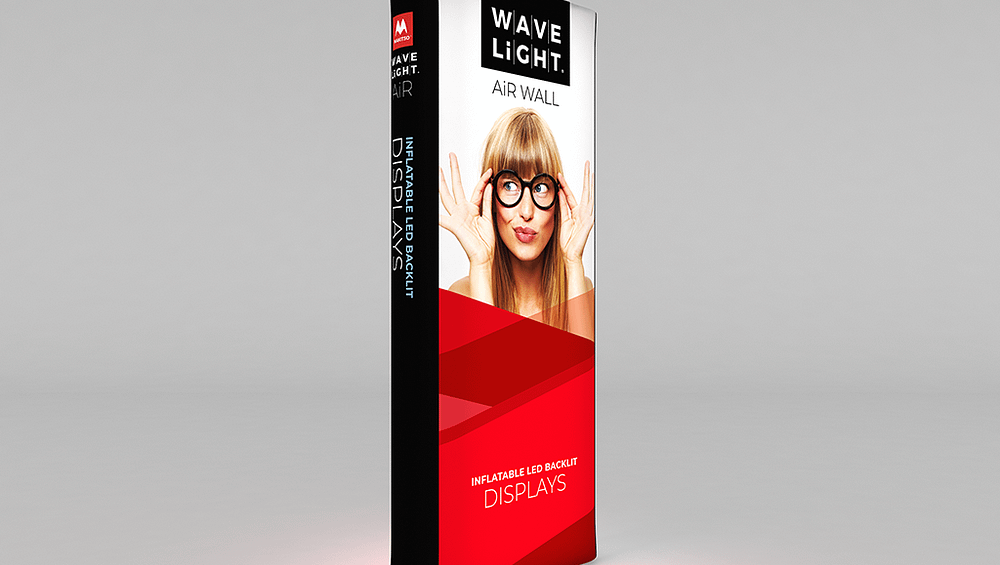
The most polished creative will underperform if people only see it out of the corner of their eye, or once they have already walked past. Poor placement silently erodes ROI by reducing spontaneous enquiries and weakening brand recall. Lightbox Fabric Banners positioned at entrances or along primary aisles, by contrast, intercept visitors while attention is fresh and decision-making is still open. Over multiple events, the gap in qualified leads can become significant.
Common Mistakes That Quietly Kill Stand Performance
One of the most persistent errors is relying solely on rear walls while leaving side views, overhead opportunities and diagonal sightlines underused. Important messages are often placed below eye level or hidden behind counters, staff and furniture. Others scatter Backlit Fabric Displays, portable LED fabric backdrop units or trade show LED lightbox stands without a clear hierarchy, so nothing reads as a hero message. These issues rarely show in design proofs, but they are obvious on the floor.
- Visitors walking past your stand without noticeably slowing or looking up.
- Repeated questions such as “So what do you actually do?” despite large graphics.
- Strong staff feedback about conversations, but weak overall lead volume.
- Event photos showing empty foreground space and logos pushed to the back.
- Illuminated Fabric Banners, ceiling-hung illuminated fabric signs or large format fabric lightbox displays glowing brightly but facing away from main traffic.
These warning signs suggest that sightlines, traffic flow and lighting are not working together. In some stands, backlit fabric wall graphics, LED Exhibition Lightboxes or double-sided backlit fabric panels are effectively turned into expensive décor, rather than the primary tools for attracting and directing visitors. Over time, this can distort post-event reporting, as teams blame message or audience fit when placement is the real weakness.
As stand space and freight costs increase across Australia, inefficient layouts become an avoidable risk. Reviewing floor plans early, mapping main aisles, and planning how custom-printed backlit banner systems or retail window illuminated fabric frames will read from distance can prevent wasted spend. Speaking with a display specialist about integrating illuminated elements and tailoring heights to each venue helps ensure your Maximizing Visibility: Best Placement Strategies for Fabric Displays approach converts passing traffic into meaningful conversations before your budget is exhausted. Consider auditing your current stand layout now and booking expert guidance so your next event layout works harder from the first visitor through the door.