The importance of graphics in OneFabric Pop-Up Banners is increasingly clear as Australian exhibitors search for portable advertising solutions that can cut through visual clutter. In busy venues, visitors scan stands in seconds, so banners must deliver a clear, visual snapshot of who you are and why someone should stop. Strong imagery, confident colour and disciplined layout work together to communicate that story quickly. When done well, graphics turn simple hardware into one of your most effective event marketing tools, helping you qualify interest before a word is spoken.
The Importance of Graphics in OneFabric® Pop-Up Banners
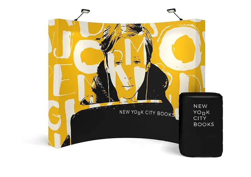
Graphics matter most at the distance where people first notice your stand. High-resolution photos, vector icons and branded event display graphics ensure your message remains crisp on fabric, even under harsh venue lighting. A restrained colour palette tied to your brand guidelines improves recognition and keeps the banner from feeling busy. Clear visual hierarchy, with a dominant headline and single focal image, helps time-poor visitors understand your core offer from several metres away. This visual clarity is critical when your banner sits among lightweight trade show displays competing for attention.
Key Design Approaches for Effective Pop-Up Banner Graphics
Designing for fabric requires more than simply scaling up a digital ad. Large, legible typography and generous negative space help avoid distortion across tension fabric pop up walls and reusable fabric banner systems. Simple, high-contrast layouts remain readable when people are walking past or viewing from an angle. Infographics, icons and tightly edited product visuals can highlight key benefits without turning the surface into a cramped brochure. For brands using multiple portable trade show backdrops, aligning type styles, colour blocks and imagery creates a cohesive visual system across an entire stand.

Balancing Branding, Messaging and Practical Use
Effective banners balance branding with a sharply defined message. Your logo, colours and key visual style should be unmistakable, but the primary benefit or call to action must dominate. For many Australian exhibitors, this means one promise-led headline, a short supporting line and a single image or hero product. Collapsible exhibition stands and custom fabric displays also demand practical thinking: copy positioned too close to frame edges may be lost in curves or seams. Planning around tool free display setup, venue lighting and sightlines helps ensure the design works in real conditions, not just on screen.
- Clarify the main outcome you want visitors to remember before starting any layout.
- Limit your colour palette to two or three core brand colours plus one accent.
- Prioritise large, simple typography that remains legible from at least three metres away.
- Use a single focal image rather than multiple competing visuals across the banner.
- Plan graphics to sit clear of seams, curves, and the edges of hardware for reliable print results.
Deciding when to refresh graphics is another important part of solution planning. If your imagery no longer reflects your current offer, or your visuals feel flat next to newer stands, your OneFabric Pop-Up Banners may be due for an update. Teams that exhibit frequently often rotate artwork for different campaigns, using compact banner carry cases to transport multiple skins. Working with specialists in portable advertising solutions can help you compare hardware options, assess durability, and match graphics to specific show formats. For organisations aiming to build long-term presence, expert guidance ensures your banners function as adaptable, future-ready assets rather than one-off prints. To explore design options, fabric choices and layout strategies that fit your event schedule, consider speaking with a display consultant who can map out the right mix of systems and creative for your stand.