Misjudging the size of a fabric display is one of the easiest ways for Australian exhibitors to waste marketing budget without realising it. On a busy show floor, where every square metre is contested, the physical scale of your walls, towers and Lightbox Fabric Banners quietly determines who sees your brand and who walks straight past. When graphics are too small, too dominating or simply facing the wrong direction, even the most brilliant creative work fails to cut through.
Customer Considerations: Selecting the Perfect Fabric Display Size
Display size matters because human vision and venue constraints set hard limits on what attendees can absorb at a glance. As a rule of thumb, headline text needs around 25–30 millimetres in height for every three metres of viewing distance, yet many Australian exhibitors still cram dense copy onto compact walls. The result is signage that looks impressive on a laptop but becomes illegible on the exhibition floor, especially under mixed lighting and from side angles.
Lightbox Fabric Banners and the visibility trap
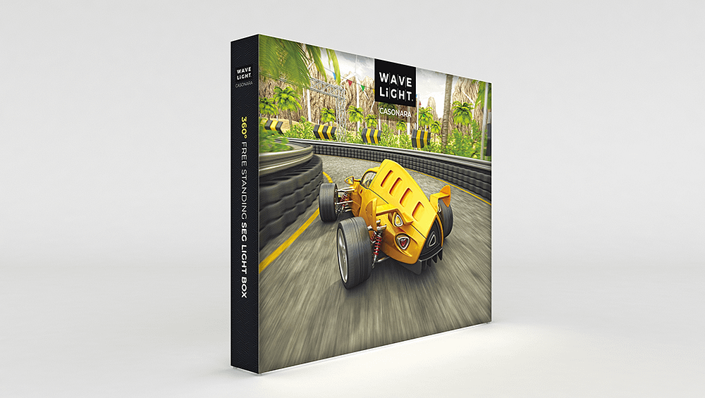
Illuminated solutions such as Lightbox Fabric Banners, Backlit Fabric Displays and LED Exhibition Lightboxes can dramatically boost visibility, but they also amplify sizing mistakes. An oversized unit can overpower a modest footprint, creating glare and shadows that make the stand feel uninviting. Undersized illuminated fabric banners, on the other hand, can vanish beside large format backlit fabric stands or overhead rigging, reducing your brand to background noise despite the investment in lighting technology.
Common sizing mistakes and warning signs
A frequent problem is locking in custom sized LED fabric lightboxes before the stand layout is final, only to discover they block key entry points or conflict with modular illuminated trade show walls. Another is ignoring traffic flow; a beautifully lit wall facing a service corridor instead of a primary aisle will struggle to earn attention. Staff routinely stepping outside the stand to flag people down, or visitors commenting that the booth feels cramped, are early signals that proportions are off.
- Logos or headlines appear cropped or too close to frame edges in double sided fabric lightbox displays.
- Oversized hanging fabric lightboxes dominate the space and obscure sightlines to key products.
- Portable LED backlit banner systems sit much lower or higher than neighbouring booths, breaking visual continuity.
- Retail window illuminated fabric panels are scaled for impact at two metres, but most viewers stand twice that distance away.
- Slimline wall mounted lightbox frames are added late, forcing awkward compromises to existing graphics.
In a tightening economic climate, Australian marketers can ill afford reprints, freight changes and last-minute hardware swaps caused by misjudged sizing. Poorly scaled illuminated fabric or large format structures don’t just look awkward; they reduce dwell time, weaken brand recall and undermine sponsorship value. Speaking with a specialist early in the planning cycle can help translate objectives, budgets and venue rules into the right combination of walls, towers and lightboxes. Before your next event or retail rollout, review your current display dimensions, map them against real viewing distances and traffic patterns, and consider booking expert guidance to adjust your setup before the problem becomes more costly.