The impact of viewing distance on banner effectiveness is one of the least understood risks in Australian signage and exhibition marketing. Many campaigns are meticulously designed on screen, yet underperform in the real world because text and key visuals are simply too small to be read at typical viewing ranges. When each 25mm of letter height only supports clear reading from roughly 2.5 metres away, banners placed ten metres from the audience are often functionally invisible.
The impact of viewing distance on banner effectiveness
In busy commercial environments, the viewing distance for hanging displays can vary dramatically within a single site. A banner over a shopping centre concourse may need to be read from escalators, balconies and ground level simultaneously. At trade shows, Hanging Banners must cut through visual clutter while people move quickly past stands. Without deliberate planning for distance and height, even premium print can fade into the background.
Why viewing distance is a hidden performance risk
The problem is rarely obvious at the design stage because artwork is usually reviewed on desktop screens or A4 proofs. This creates a false sense of clarity that collapses once the piece is scaled up and installed in a cavernous hall. In high ceiling exhibition banner placement, a headline that looked bold in PDF form can shrink to the point where only those directly underneath can read it. Brands often misinterpret this as a creative issue instead of a legibility failure.
How distance problems appear in everyday campaigns
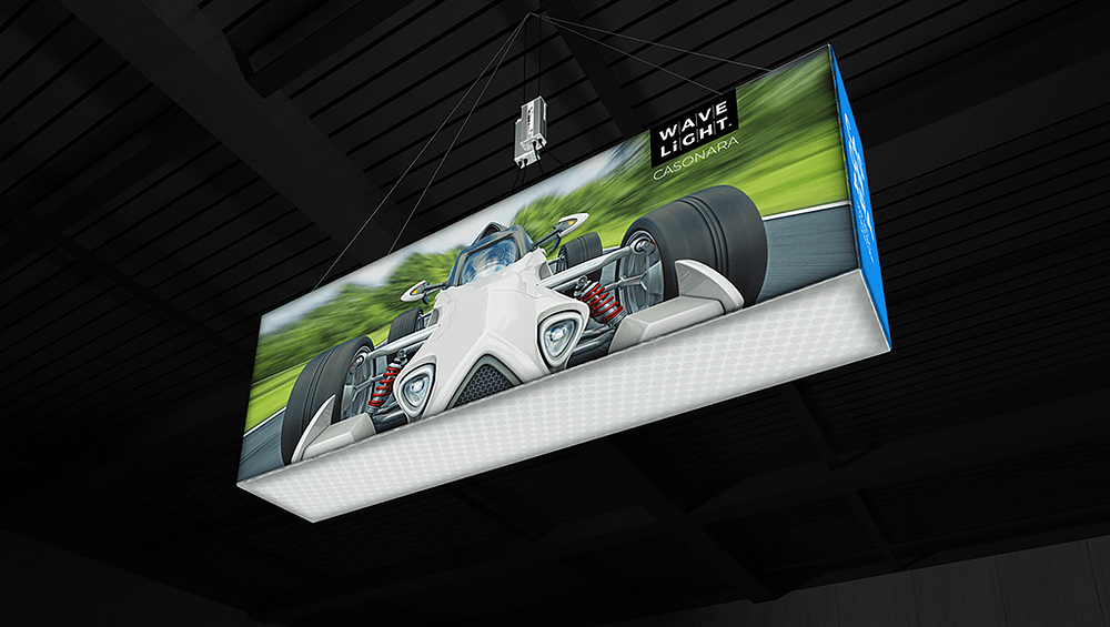
The consequences show up across outdoor, retail and event marketing. Roadside banners packed with copy become illegible for drivers travelling at 60km/h. In exhibition halls, Hanging Exhibition Displays positioned above aisles lose fine detail and small logos. Organisers of Overhead Trade Show Displays often discover that conditions, dates and URLs vanish beyond a few metres. In large arenas, suspended fabric signage for large venues might look impressive on camera, yet fail to communicate pricing or wayfinding on site.
- Lettering sized for three metres being used at ten metres or more.
- Low contrast colour palettes that blend into interior finishes or sky.
- Crowded layouts that force viewers to decipher multiple competing messages.
- Decorative or ultra-light fonts that break up when viewed from afar.
- Ignoring line-of-sight planning for ceiling displays in complex venues.
Left unchecked, these oversights lead to wasted media spend, poor brand recall and frustrated visitors who cannot locate offers or facilities. Early warning signs include staff repeatedly answering the same directional questions, foot traffic flowing past without slowing, and customers misquoting promotion details. In venues that rely on arena-scale suspended display layouts or overhead trade show wayfinding graphics, low response rates despite high exposure are a strong indicator that long-range readable hanging banners were never properly specified.
As formats grow larger, the optimal height for overhead banners and the balance between copy size and distance become strategic decisions, not aesthetic tweaks. Australian organisations investing in Suspended Fabric Banners, retail atrium installations or Overhead Trade Show Displays benefit from involving signage experts early, before artwork is finalised. If you suspect your current banners look sharp in presentations but disappear in situ, now is the time to audit key locations, measure typical viewing distances, and seek professional guidance on recalibrating size, typography and placement. Book a review with an exhibition or signage specialist before your next campaign so every square metre of print works harder rather than silently draining budget.