
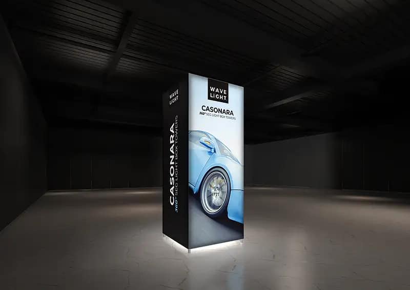
WaveLight® Casonara Towers promise serious visual impact on busy exhibition floors, yet many Australian brands fail to customise them strategically. In venues like ICC Sydney and MCEC, where visual noise is constant, treating these structures as generic portable display solutions can leave even strong brands virtually invisible. Without deliberate decisions on height, footprint, lighting and creative, exhibitors risk turning premium hardware into little more than expensive background scenery.
Why customisation decisions matter for Australian exhibitors
In competitive trade shows, customisable exhibition towers act as vertical billboards, drawing attention from crowded aisles and across multi‑level halls. When tower dimensions are chosen simply to “fit the stand” rather than defined campaign objectives, important messages can sit below sightlines or vanish behind neighbouring builds. Poorly planned placements also waste opportunities to create genuine trade show landmark displays that guide visitors from a distance. The outcome is a stand that blends in instead of anchoring the brand.
Common mistakes with tower size, graphics and lighting
One of the most frequent errors is focusing solely on artwork files while ignoring structural options such as height, orientation and whether modular illuminated tower displays are needed for different stand configurations. Dark, low‑contrast imagery might look dramatic on screen but absorbs rather than reflects light, undermining the benefits of premium backlit exhibition columns. Teams also regularly order a single generic graphic set and roll it out for Sydney, Brisbane and regional shows, even when audience profiles and offers change significantly between events.

How missed options show up on the show floor
The first warning signs usually appear once doors open. Towers specified at the wrong height can be lost behind hanging banners or venue signage, nullifying the promise of high-impact retail light towers. Intricate designs and tiny typography may impress in the studio but become illegible from six or eight metres away down a busy aisle. Inconsistent colour balance between SEG fabric tower graphics, shell-scheme panels and digital screens further weakens brand recognition and reduces recall after the event.
- Overlooking 360‑degree visibility and designing as if the tower were a flat wall.
- Ignoring how branded LED tower structures interact with venue lighting and neighbouring stands.
- Failing to plan reusable event tower hardware for different stand sizes and orientations.
- Not considering how lightweight marketing displays will bump in or comply with venue power limits.
- Treating interchangeable graphics as an afterthought instead of a core strategic asset.
Suppliers report that LED intensity and colour temperature are rarely discussed, despite their influence on skin tones, product photography and corporate colours. Many teams also underuse the flexibility of a tool-free tower assembly system, locking themselves into one static layout rather than reconfiguring towers between shows. When WaveLight® Casonara Towers are used this way, they stop functioning as modular illuminated tower displays and become rigid props that can’t adapt to evolving campaigns or audience segments.
If staff regularly hear visitors say “I walked past and didn’t realise it was you”, your tower strategy likely needs expert input. Low enquiry levels despite heavy foot traffic, or repeated last-minute artwork changes, suggest a reactive rather than planned approach to customizable exhibition towers. Concerned your current tower display isn’t working as hard as it should? Review photos from your last event, note where visibility or clarity dropped, then speak with an exhibition display specialist to map out smarter customisation before your next major show.


